Sunday, May 5, 2013

Transferring Patterns with Sulky Pens!

Since my last post, I managed to finish a new embroidery piece for the April 2013 SAL hosted by the Flickr group New Embroidery with Vintage Patterns! It's called "Floral Umbrella", and here is the Photo Set with different views of the finish :)

I am currently writing another Epic Embroidery Start-to-Finish Post, but I wanted to share some thoughts on the embroidery pattern transfer process I used! These transfer images are from a specific project but the guidelines are general :)

As I mentioned in my last post, I was SO disappointed when my Black Sulky Iron-On Transfer Pen finally ran dry and I couldn't find a retailer anywhere locally! Having a good transfer is essential to any embroidery project, and although the pencils do work (I used them for my Couched Rose), they are hard to control and transfer faint.


Shortly before Easter, my Stitchy Guru Mother suggested that I look around online, and made me an offer I couldn't refuse (LOL!): If I could find some for a decent price, including shipping, she would buy them for me as an Easter gift. With that incentive, I hopped online faster than you can say "bunny" ;) But I hit dead ends everywhere!

Sulky recently expanded the colours in the line and repackaged the product into 4 and 8 pen multipacks, and although the individual pens are still available, most stores seem to have opted to carry the new packs only. Sublime Stitching, run by authoress Jenny Hart, stocks the 8-pack and the individual Black pen only, for example.

I can understand this from a business standpoint as there is less product to carry, but as a beginning embroiderer, I'm not yet interested in investing so heavily in the pens. Also, the rainbow colour spectrum - the 8-pack has Black, Green, Blue, Brown, Orange, Yellow, Red and Purple! - didn't personally strike me as very useful.

Image from the Sulky Transfer Pens Product Page

However, I've discovered that some embroiderers, like Giddy99 on Flickr, like to colour code their patterns, as shown in this project. The near-finish shows that this worked awesomely for that primary colourway, but I'm not sure how it would work for more muted colours and intricate patterns? It would take some experimenting ;)

By the way, the lady whose image appears on all the STP marketing is Joyce Drexler, who co-founded the company Speed Stitch with her husband Fred in 1979 (this info is from an interesting article about them both). Speed Stitch is now the online retailer The Uncommon Thread, which is the authorized seller of Sulky products in the US and Canada. They do carry Sulky Transfer Pens, but they only accept US funds.


It took me several days to locate retailers (willing to take Canadian funds and ship to Canada) who had any of the products in stock and it was a frustrating search, because Sulky's own Retailer Locator is very out of date. Also, a lot of the smaller quilt shops do not have websites, or if they do, they do not take online orders. Many don't even have product lists, so there's no indication of what Sulky lines they do carry. And some, which seems rather incredible in this day and age, don't even have e-mail (?!).

Finally, I determined - astoundingly - that the best place to order from was Dharma Trading in California! Although the company specializes in fabric dyes, they carry a good selection of quilting notions and accessories too. This was not actually the lowest-cost option, but it was the least expensive from an established company. I have heard great things about DT over the years from the beading community, and a good reputation is extremely important to me when dealing with unknown retailers.

It seems many online stores these days do not have "bricks and mortar" storefronts, which is fine - and can be quite an advantage when it comes to product availability - but there are many that do not have any contact information, and that's suspicious.

So I finally bit the bullet and ordered craft supplies online for the first time ever :) I bought 2 Black Sulky pens, 1 Blue pen (Dharma also carries Yellow and Red), and a white Nonce pencil for marking on dark fabric. As a nice bonus, Dharma offers a free gift with your first purchase, and I chose the silk scarf (in bag, below). I've seen some interesting tutorials online for dying these with Kool-Aid or Sharpie Markers, but both methods need ventilation, so I intend to try it out when the weather is warmer :)


I'm making a point to mention Dharma Trading here because I had a lot of trouble trying to find retailers that were willing to answer e-mails or questions in a timely manner, and I was also really impressed by the company's customer service. Ideally, I wanted two specific types of Sulky pens - the Black and the White. I have learned from reading online quilting forums that the Yellow does NOT write on dark fabrics, only on lights. So I e-mailed Dharma to ask if they were intending to carry the White.

The DT customer service rep consulted their contact at Sulky, who forwarded some important information: the White pens were so problematic, the company stopped making them some time ago! Any on the market are very old stock, and not likely to work. Here is explanation at the Sulky site, but basically there is no white ink at the moment, and the White pen was filled with thinned paint which was very difficult to control - necessitating the black "pump" on the top - tended to clump, and dried up.

Needless to say, I would NOT have been pleased to purchase a dud product and have discovered this the hard way. Since my order with Dharma, by coincidence or design, the White Sulky pens have been removed from the Sulky website. Here is a product photo from A Great Notion, which is an online retailer in Vancouver, CA that carries all kinds of neat and hard-to-find notions that is another source for Sulky pens for anyone interested in ordering them. They are well worth taking the trouble to find :)

A word about prices: My total purchase at Dharma, including Shipping from the US to Canada, was very reasonable, and bought me almost two-thirds more than if I had gone with some other online stores, including several "specials" on e-Bay. However, shipping prices from the States to Canada have more than doubled since my Mom's Easter gift to me, which is something to be aware of when sourcing supplies online.

I should also say that I made the purchase with a special time-limited credit card for online-use only, a precaution I highly recommend taking. Although the final result was very satisfactory, I've always had the illusion that anything is available easily on the internet, and that is no longer the case for craft supplies! It's very troubling.

Now, on to the fun part!


For this project, I decided on a blue 100% cotton background fabric (NOT shown above, that's posterboard!), so I wanted to try out my new Blue STP! (I have noticed that my pen cap looks much darker than the turquoise colour cap in the new packs, but I'm not sure if the ink colour has changed). In my excitement, I forgot to take a picture of the package before I opened it (oops). Here it is out of its packaging:


As you can see, the barrel of the pen is sleek and straight, and not much larger than a standard ballpoint pen. It is very easy to hold and comfortable to grip! The cap is short, and can be stuck on the end of the pen while working, or put aside as I did (I tried keeping the cap on the end first, but was worried it would fall off while I was tracing). The cap on this one is a little bit finicky, and needs an extra wiggle or two to connect tightly when finished. I do prefer the longer caps on the older models, but these do the job. I put mine back in the packaging between uses, for now at least.

Iron-on pens (and pencils) are, as the name suggests, permanent, meaning that the transfer lines never wash out, although the Sulky package does state that they can lighten over time depending on the fabric used. The "How do the Sulky Transfer Pens work?" question on the Sulky FAQ page is short and well worth reading.


The nib of the pen is brush-like and very sensitive to pressure, so finding the right balance for writing is the trickiest part in the whole process! As the FAQ page states, the ink is contained in a reservoir in the stylus, and pressing down on the tip opens the valve that governs the ink flow. Too hard, and your ink leaks and splatters (and you might break your pen), too light and you don't get enough ink to transfer.

However, I never had a problem with too little ink :) In fact, having a "fresh" new pen is amazing, because once you start the ink - with one or two gentle presses of the nib on some scrap paper - the pen just glides smoothly over the paper! It's amazing :)

The ink came out very dark at first, almost a navy, but lightened after a few practice strokes. When you increase the pressure it does get darker again for a while. So I found it helpful to keep some scribble paper around to use for adjustments.

My biggest weakness is that I don't have a lot of experience with tracing, and I haven't really done it in years, so it's going to take some time to build that skill up again. I'm intending to try and get some felt tip artist's pens to practice tracing lines with, because ballpoint pens - even gel pens - have a totally different feel.

There is nothing to press with, and pressing only adds ink you don't need, so I found it best to keep my touch light but firm, and to try and trace lines in "swoops" - big sweeping motions, from the line start to the stop if possible, - rather than "strokes", because the joins where you lift the pen off the paper and replace it will show.

I did find that having a firm steady surface to trace on with a softer surface right under the pattern helps a lot. This sounds a bit strange, but it just means that I used a lapdesk with a thick wooden top and then put the pattern on top of the pad of graph paper I was using for the transfers. Tracing on a tabletop also works really well!


Here's a photo of my pattern print-out, my tracings and my Blue STP! Normally, I'd only trace the pattern in one part. However, since I wanted to applique the umbrella, I did two transfers: the handle and flowers (to be ironed to the blue fabric) and the umbrella (to be ironed to the yellow fabric and then appliqued to the blue fabric).

As you can see, I printed off the pattern as original and in reverse, because I wasn't sure which image I wanted to go with. I was glad I did this, because I did change my mind! Although I sized my transfer to 4.5" square, I ended up extending the sprigs on either side and the finished stitching is roughly 5" square.

When working from a digital image like I did, I've learned to edit the image and crop the white space as close to the pattern as possible, because it makes it so much easier to determine the real size of your transfer more accurately! You can then resize your image (make it larger or smaller) with more confidence too :)

Here is the Flower Transfer:
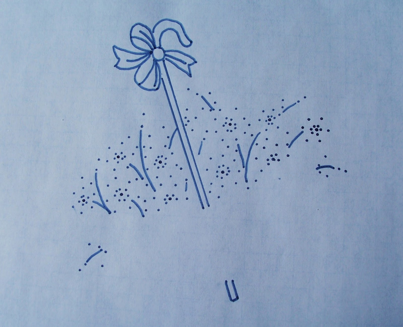

As you can see, I followed the method I discovered while transferring my Floral Heart, which is to only dab the pen at the critical junctures for the flowers. For the handle, I used the edge of the packaging as a ruler (because I didn't think to grab a ruler ahead of time), and I traced the whole bow. I left out the corner flower though.

And here is the Umbrella Transfer:


For the umbrella, I only traced the shape and the ribs, I left off the directional lines that were meant to add shading. I was interested in the idea, but decided to leave the decision until later, and I'm glad I did, since I decided that it would be too busy.

From what I've read online, Tracing Paper is suggested for use with the pens. There is a huge variety of Tracing Papers though from the thin onion-skin types to the thick artist's sketch paper, and I went with what has worked for me so far: Graph Paper. This is the regular inexpensive blue-lined type you can buy in packs most anywhere.

Although it doesn't show up well in the above pictures, the grid lines are still visible through the transfer - I use the blank side to trace on - and this can be very helpful when placing the transfers on the fabric. Here is the Flower Transfer held up to the sunlight so you can see what I mean, please pardon my fingers:


The transfer instructions on the back of the packaging are also on the Sulky site!

NOW - I honestly had really good intentions here. I had my camera at the ready to record the transfer process but it happened SO FAST that I never got off a shot! All you need is an ironing board, parchment paper to protect the surface (NOT wax paper!) or an old towel, and an iron - along with your fabric and transfer.

If you have wrinkles, iron your fabric first (you may have to use steam, in which case be sure to let the fabric dry thoroughly before transferring anything). My Stitchy Guru Mother's tip, when working with 100% cotton, it to loosely roll it up and put it in a plastic bag in the freezer for half an hour, and THEN iron it. I was very skeptical, but it worked like a charm! Wrinkles will mess up your transfer lines.

Try transferring a small scribble on the corner of your fabric first because the material will make a difference and you'll know how your finished transfer will look. You may need to adjust your times completely. This is why trial designs (also called test designs) used to be included with pre-printed iron-on pattern packs :)

Then center your pattern, ink-side down, on your fabric, and rest the hot iron (no steam) over the transfer, pressing lightly but firmly, and then count off the seconds. My package says 30-60 seconds, the Sulky site says 30, which is what I used.

With my old pen, I needed that full minute and more, and had to be constantly checking the transfer, which is risky because it is so easy to accidentally move your paper and ruin your transfer (and your fabric, woe!).

With the new pen, I was AMAZED how fast it transferred!!! If you don't want your lines super dark then try 20 seconds and then left up a corner to see how dark it is - if it's too light, lay the corner down and repeat. Getting nice dark lines is not a problem, and they are crisp and clear, unlike the pencils which bleed and blur and smear!

A few amazing seconds later, VOILA!:


ABRACADABRA! ALAKAZAM! BIPPITITY BOPPITY BOO!
I have a wonderful transfer, and with Sulky, you can too :) LOL!

Can you tell how EXCITED I am about this?! Can you, huh?!!! Hint: It's a LOT ;)

If Sulky made a commercial for these pens, it would have glittery fireworks and peppy music for the many happy embroiderers dancing down the neon-lit street with arms full of perfectly ironed-on transfers on reams of colourful fabrics, just waiting to be stitched with the ribbons of sparkly threads that are twirling by in the air!

I know this sounds a little extreme. I know there are a lot of needleworkers (quilters, embroiderers and tranfer-ers of all stripes) who will disagree with me, some very vehemently. There are those stitchers like Mary Corbet who thoughtfully point out the limited use of a product that leaves thick, permanent lines on your fabric.

You really don't want to have those lines showing under your embroidery, and it's a valid concern. It would be WONDERFUL if the Sulky Transfer Pens were available in different nib sizes, including Fine-Point! I fervently hope Sulky is working on that right now, in fact, along with the problem of White Ink for Dark Fabrics (please, OH PLEASE, solve that soon! Think of all the poor dark fabrics who long for embroidery in bright cheerful colours!! And the sad embroiderers who cannot fulfill that wish!!!)

But for a beginning embroiderer, who wants nice clear vivid lines - lines that will not fade, that will not wash away - to guide their first stitcheries, this product is a little miracle! No taping your fabric to your window and trying to trace your design with a pencil. No fussing and fooling around with powders and paints and brushes!

The Sulky Transfer Pens are Easy to Use. They are Fast. They do exactly what they say they are going to do, and you really can't ask any more than that!

Of course, you can forsee my obvious problem now, right? I really should have bought the 8-pack in the rainbow of colours, LOL! In fact, there should be Pink! ;)

Oh, and the umbrella? Here's the transfer, all trimmed and ready to be appliqued:


NEXT TIME: The Wonder of Stitch Witchery, The Amazingness of Applique, and The Sheer Pleasure of Spontaneous Stitching! Please stay tuned ;)

Have you tried STPs? Did you love them or hate them?! I'd really like to know :)

Disclaimer: I was not compensated for this review in any way! I'm always looking for products that make my stitching easier, and I love to share them when I do :)

Friday, April 26, 2013

Floral Heart, From Start To Finish!


EDIT: This post has been updated; I accidentally forgot to add a photo and a paragraph of text (oops!). Sorry for any confusion this may have caused!

It is wonderful to have inquisitive and enthusiastic friends! When I shared the happy news of my Floral Heart Flickr Contest win and wonderful DMC Feature, I received some lovely comments and e-mails that not only offered congratulations but asked interesting questions about the process of embroidering the heart too! So this post is my answer, where I'll try to explain the project in photos as well as words :)

A word of warning: this is going to be a looooooong post, with lots of pictures! Seriously, this is an EPIC post, about weeks of intensive stitchy experimentation :)

Before we get into the details, I want to mention here that the marvelous Karen, of Karen's Colourful Creations, even took the time to write a post inspired about my thoughts on the importance of showing WIP photos! So please go and visit Karen to read “The Final Finish”! Go ahead right now: I'll wait :) ... Are you back? Great!

I've mentioned before that Floral Heart (hereby referred to as FH for short) was, in many ways, a Mistake - a HUGE chain of Mistakes, actually - that only gradually resolved into a very Happy Accident :) The finished work only came about after one response to a problem created another problem that had to be fixed, and so on and so forth. And this started right from the beginning with my pattern choice.

Before I even learned about the New Embroidery with Vintage Patterns' "New Year, New Embroidery" Flickr contest (via this post at the Feeling Stitchy blog), I had been contemplating stitching some flowers to replace the roses in my blog banner. And I have been thinking about DMC Perle (Pearl) Cotton #5 skeins for quite a while. As you may know, I love to use #8 (on the spool) for Blackwork on Aida, but am unable to get many other colours here. There is a slightly larger - about 40 colour - selection of #5 available at Michaels, and every time I go there I find myself staring up at it on the pegboard shelf display and loving how rich and shiny most of the colours are.

But DMC PC #5 is much thicker than #8, and not suitable for Aida, except maybe very large 11 count or Monk's Cloth (the fabric used for Swedish Husk Weaving and Rug Hooking). And ever since my Bluebirds of Happiness, I've wanted to try some more embroidery. And then I found out about the contest :) It seemed like fate!

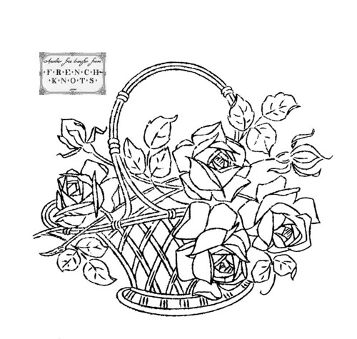
Part of the contest requirements was to use a veritably vintage embroidery pattern. So I started searching around online. My first choice was this lovely rose basket offered by Flickr user Niccivale on her French Knots blog (pattern here on Flickr, and in this post). I downloaded the pattern off of Flickr, not her blog, otherwise I might have noticed this little disclaimer: "This basket of roses has so much detail…not for the faint of heart!" Oopsies, LOL :) My heart was strong, but the detail was overwhelming! A lot of the problem was the wonky way my transfer turned out.

basket_roses

I only intended to outline the elements in stem stitch anyway, and couch the basket down, but my design transfer went very wrong. First, my Sulky black transfer pen (that was bought over a decade ago by my Stitchy Guru Mother) finally gave out on me, and I had to use one of the red iron-on transfer pencils instead. No matter how fine I tried to keep the lines, when they were ironed, they blurred, and I realized about half-way into outlining the basket (my couching tests had all failed me, since I didn't have the right colour braid and was unable to obtain any) that I would have to fill in the entire piece. That is A LOT of filling, and I wasn't confident enough to try!

But I loved the materials enough that I wanted to reuse them. Here is a picture of the threads I had bought for the Rose Basket, the DMC Perle (Pearl) Cotton #5 in: 498 (burgundy), 699 (dark green), 702 (green), 725 (yellow) and 899 (pink). I later added the white (final floss toss). The brown I intended to use for the basket is an Anchor thread (#901), one that I won from Agi's giveaway (back in September 2011):


I had intended to use a dark brown braid and perhaps couch it down with the brown PC. But all the braid I had was too thick or too thin, or entirely the wrong colour. In Agi's prize package there were also some very cool skeins of a thick rayon in brown and green, and I thought to use the brown (seen below) in place of the braid. The thread is "Stick Twist" Kunstseide (rayon) #20, Farbe (colour) 2307, Artikel (type) 7500. I'm not sure who the manufacturer is, but the label is navy. This photo, taken with the flash, shows its shine; the Rose Basket pattern is in the hoop:


But after trying both browns out on my tester, I concluded that the rayon - while a perfect match close up - faded away into the fabric when seen from afar.

Here is the testing process I used for the couching idea, that lead me to discard it. I cut out a scrap of my ground fabric, which was a remnant of deep gold velveteen. There was a big fade mark down the middle and on one side, which is why it was deeply discounted, so I had to cut around those to get useable fabric for everything.

I mounted my little snippet in my 4" hoopla, and used a black Sharpie (regular tip, since I wanted to see how much the couched thread would cover) to draw some vertical lines on, using a plastic ruler as a guide, just eyeballing the placement:


Then I just started experimenting with thread and stitches. I forgot to take a picture of the tester at the end of this first stage, but here is a close-up of my couching tests:


From left to right: Stem Stitch, Whipped Back Stitch, Couching (x 2), Whipped Back Stitch, Couching, Stem Stitch, Backstitch/Whipped Back Stitch split, Laced Back Stitch, wider Laced Back Stitch, Whipped Back Stitch (which was my favourite) and my variation, a Whipped/Knotted Back Stitch, which I liked but was too thick!

By the way, the colour of the fabric changes a lot in these pictures because of the nature of the velveteen itself - it gets darker and lighter depending on the lighting and the angle. Also, all those fluffy little clumps and dusty-looking bits above? That's the fabric itself.  I didn't bother to serge the testers, and the ends did not fray so much as shed, dropping little clumps everywhere! And whenever I came up through the fabric, I got a plethora of velveteen dust :) The pile, although much shorter than that of velvet, was also easily crushed, and you will see the marks from my needle in some of the pictures, but thankfully it bounced back! But it worried me while I worked.

So after I discarded the idea of couching and the idea of filling in the rose basket, I "went back to the drawing board", and started searching for another pattern. Now, the thing with a SAL is that it is timed, and I am not used to working on a deadline for creative projects. Although the NEwVP Contest started on January 1st, 2013, I didn't find out about it until the second week of the month, and by the time I finally gave up on my first pattern, I only had a week left, and the deadline was February 10th!!!

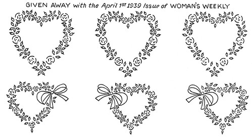
Therefore, when looking for my new pattern I wanted something simple and small that would be quick to stitch. I looked through a ton of free vintage patterns (the Flickr Group Hoop Love is an incredible resource, as is the Needlecrafter Pattern Library, which is unfortunately no longer updated) and although I had a tough time narrowing things down, I kept coming back to one sheet of patterns in particular, this gorgeous set of hearts and flowers shared by user k0dama:

flower hearts

I thought that both hearts were sweet, but the little ribbon bow on the bottom transfers sold me on the design, and I decided that I would like my bow on the right (as it is on the far-left side of the sheet) and so I used the reversed design (I cropped the center pattern). In Microsoft Word, I enlarged my heart, until I liked the look. The finished work is roughly 5 inches wide by 4 inches tall! I printed it off on thin graph paper, so that I could see the lines and the pattern:


And then I flipped the print-out over, and used an iron-on pencil to trace the design elements. The pencil I used is the same as the one shown in my Couched Rose post. However, given my troubles with the lines turning out too thick on my first transfer, and my experience with the difficulties I had with my Bluebirds of Happiness in trying to match the actual Lazy Dazy Stitch to the tear-drop pattern shape, I tried something a little different.

I traced the outline of the bow, but for all the flowers (both daisies and roses) I only traced the crucial junctures. So on the daisies, I placed one dot on the bottom of the stitch, and another at the tip of the tacking stitch. For the roses, I placed a dot at the end of each line, both straight and curved. The French knots were also dotted in. It looked like this when transferred to my fabric:


Here is my transfer in my 8" hoopla. I had to use the flash to get the design to show up, which is why the colour is so washed out. As you can see, the dots transferred clearly, although they were not as noticeable when working as they are in this photograph. You can also see I had quite a mess of dots, LOL :) I had to refer to the design constantly while working, but this is a method I'll be using again!!!

However, this is where things started to get tricky. This is roughly what I had in mind (the gray indicated the white for the daisies), a lot simple outline stitching. French Knots for the flower centers, Lazy Daisy (Detached Chain Stitch) for the daisies, simple Straight Stitch for the roses (with a tacking stitch in the middle on the outer three stitches to make them curved), and Stem Stitch for the ribbon bow:


And this is the design that I started stitching. But very quickly, it turned into this:


If you've been following the project, or visited my contest entry, you'll already be familiar with these stitches, but I'll give more details on them as I used them.

First, I outlined the ribbon bow in Stem Stitch. I started here because I thought it would give a solid place to anchor the threads for the other colours. And then I anchored the yellow in the bow and made the French knots:


I know you can technically use an "away knot" or a "waste knot" (or, as Mary Corbet calls it in her excellent photo tutorial, an "away waste knot"!) to start any thread right away. But the French Knot is a most wily creature, and I find it expedient to firmly anchor the thread I'm using before I attempt to capture them with my needle (as they will quickly take any means of escape, including unravelling, if possible).

So, I still used French Knots for the flower centers, and outlined the ribbon bow with Stem Stitch, but everything else changed :) The catalyst for the change was the roses; in stitching diagrams, especially for patterns, the same simple stitches are used frequently. However, that rose - with the three straight slanting stitches and the three curved outer stitches - looked strange to me. It bothered me, even as I was stitching. I decided that Bullion Stitch must have been intended for the roses, and I couldn't shake that idea! So I got out my tester again:


Here you can see that I used a Sharpie marker again - this time a fine point one - to draw the rose shape out. The poor little blob in the middle is my first attempt at making Bullion Stitches, LOL :) I nearly gave up at that point! And then I tried again. As you can see, I followed the lines - I worked the French Knot first, then the three inner stitches, and then the curved outer stitches. But it was missing something.


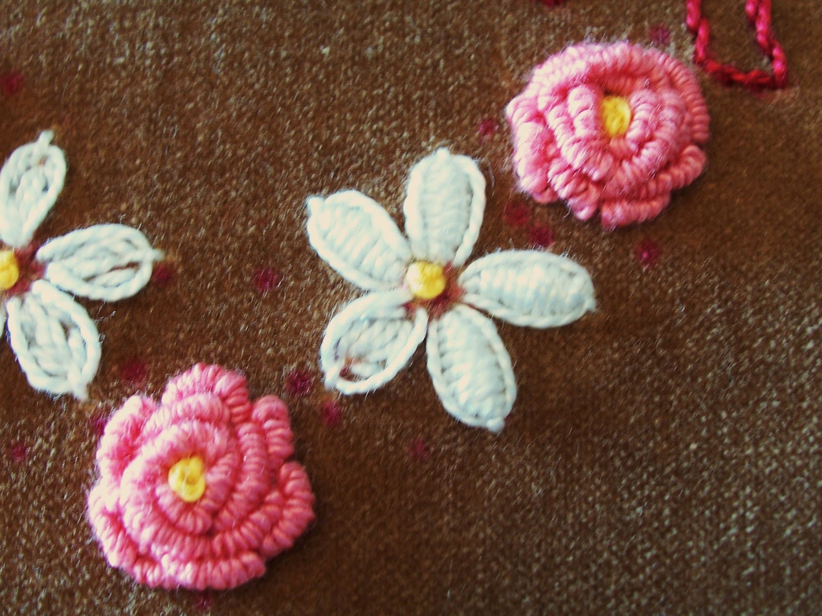
So for the last rose, I used the pink I planned to work with, and did the French Knot in the yellow I was intending to use only for the daisy centers, and I liked the result. It reminds me of the wild roses that grow in my Grandma's garden :)

So while I was feeling brave, I decided to try the roses out before I lost my nerve:


It was full-dark when I took this photo, which is why it's so dim. You can actually see the white-ish marks in the fabric around the roses, and this is where I had to rest the needle to wrap the thread and then tug hard to pull the needle through. Although I soon found that loosening the fabric in the hoop (hence the hoop marks at right) and resting the area to be worked on the corner of a cushion helped to keep the needle lifted slightly away from the fabric, I found that this crushing was unavoidable.

I started out trying to follow the stitched guide - those two sets of lines! - as closely as possible, and the two small roses at the top follow that exactly. But the bigger roses looked way too small, so I just kept adding loop upon loop until I liked the look. This took a while, and I ended up taking back quite a few poorly placed/stitched bullions, which is quite an arduous task (you need to be very gentle coaxing the wraps apart). I also went back and added some more wraps to the medium rose later! It was honestly hard to know when to stop adding new wraps :)

Before I even attempted the tester roses, I searched out information on Bullion Knots and found that Mary Corbet (of Needle N' Thread) had the most helpful post, full of tips and a stitch video! This was a GENIUS suggestion:

”1. Use a milliner (or straw) needle. The long shaft gives you lots of room for wraps, and the fact that the shaft and the eye are the same diameter make it easier to pull the thread through the wraps."

I didn't have a milliner needle and wasn't able to buy one locally, so I used the longest, straightest needle in a Singer sewing needle assortment pack I happened to have. It makes such a difference! I really believe that the needle you use is The Secret to Bullion Knots! It is so much easier to slip the thread through the wraps!!!

Speaking of needles, all the needles I had (that my Stitchy Guru Mother had, more accurately) in my stash were either too large or too small for my pearl cotton! I actually stitched the bow and the French Knots with a too-large needle, and the thread kept slipping out. But Mom rescued me (thanks Mom!) by coming home one night with two packages of Clover needles: Gold Eye Embroidery Needles (No. 3-9) and Gold Eye Chenille Needles (No. 20). They are pricy ($4 a pack CA), but worth it.

These saved my project, and I can't recommend them enough! The tips are super-sharp and the plated eye just glides through the fabric. It really reduces the strain on your hands (and after all those Bullions, my hands were plenty sore let me tell you!) and also reduces the drag on your thread, which means you can work with longer lengths :) This is a happy thing for me because I dread and detest darning!

And I should probably mention that mid-way through my roses, I managed to sew my work to the cushion below it, and I have photographic proof, LOL:


There is now something I dread more than darning, and that is unpicking my work from an unintentionally-added object. Thankfully, the poor cushion wasn't harmed!

After all the roses were finished, I turned my attention to the daisies. I stitched them as I had planned, with simple Lazy Daisy stitches. Next to the nice plump roses, they looked positively skeletal, so I filled them in with straight stitches (bottom daisy):


The straight-stitch fill was better (I did all the petals in the same sequence of stitches, just improvised to fit into the tear-drop shape), but still lacking. Then, in a fit of mad desperation, I tried something, and didn't even test it first (which I should have):


I started filling in the petals with Straight Stitches worked close together, and before I knew it, I had started doing Padded Satin Stitch! (The abundance and variety of embroidery stitches is amazing, and any mistake you make consistently you can just call a stitch "variation", isn't that great?! ) It's actually really funny, because I have always liked the look of Padded Satin, but I find Satin Stitch - supposedly the easy stitch - to be the most difficult! Trying to get the straight stitches to lie evenly and snugly is really hard. I would actually have been too intimidated to try most of these stitches if I had planned them out first!!! And I would have totally missed out :)


This is a really bad diagram describing the steps. On the first flower on the left (#1), from the top petal clockwise around the flower, I tried to show the filling stitches on each petal. The second flower at the right (#2) shows the satin stitches over the padding, hopefully. My diagramming skills leave a little something to be desired :)

At first I thought that the petals looked too much like little cocoons, LOL, but as I kept working I decided I really liked them. It would logically be easier to stitch the filling first and then do the Lazy Daisy outlining later, but I actually like way this worked out. The tacking stitch at the top serves as the perfect guide for the first filling stitch, and by working within the loop of the stitch, you can judge how long your Satin Stitches need to be to pull that loop tight and make a defined outline :)

Although I was very pleased with the petals, the bare gaps between them and the center French Knot bothered me. Still in an improvisational spirt, I took up my yellow thread and returned to my tester:


You can see my Clover needle there in the hoop to the left (the first needle on the left, stuck in the corner of the fabric, is the one I used for my Bullions!), which made stitching the daisies so much easier! I really don't think that the Satin Stitches would have lain so smoothly without it :) In the middle was my first thought: MORE French Knots, LOL! But I didn't like the look, as it was too crowded for my liking.

So, I tried doing a Lazy Daisy stitch around the French Knot, adding little tacking stitches (Couching it, essentially), as you can see in the second from right yellow dot. Better, but still not quite it...So then I decided to wrap the thread around BETWEEN the tacking stitches, sort of like the Whipped Backstitch I had been experimenting with for the Basket. And Voila! I had my Daisy Centers ;)

This is how it looked with all the flowers stitched:


The large blotch around the top right daisy was more crushed pile! It was full dark again by this time, so the photo is dim (sorry!). It took me an entire day of stitching to put in the daisy outlines and then figure out the filling, but by the time I was done, I finally felt that I could finish this piece! And so then, naturally, I got fancy :)

I decided to tackle the bow with some intensive fill stitching:


For the bow, I used Padded Satin Stitch. The three steps I used are illustrated above: first I did a line of Back Stitches up the center (#1) and then I added little Straight Stitches on the sides in a "v" formation following the direction I wanted the ribbon to seem to flow (#2), and then I covered this padding with Satin Stitch (#3). This is not a popular way to do this stitch, in fact an even fill of Split Stitch is suggested, but this felt the most natural to me, and I like the gently raised effect in the middle.


Here you can see the filling stitches (it was still dark, so the photo is dim, sorry). And here it is the next day after all the Satin Stitches were finished:


As you can see, I also outlined the center dot of the bow. When I had the rest of the ribbon finished, I had the same problem I had with daises - there was a gap between the Padded Satin Stitch and the center. And so I solved the problem much the same way! I added another layer of flat Satin Stitch over that of the first to give it a little bit of height, and then starting at the top of the circle, I did a single Detached Chain Stitch around the center pad, tacking it down around the circle with closely placed-together stitches (Couching, more or less). I later learned that this could better be considered a variation on Outline Stitch, called Straight Outline Stitch since it is not worked at an angle, but I can't find the reference link at the moment (argh!).

While I was working the Satin Stitches on the ribbon, I was thinking about a real ribbon bow and how the tops of the loops puff out to catch the light and how the bottom twists recede. The reason I stopped where I did for the night in the first bow photo above is because I intended to only pad those parts of the bow to make them stand out. So I stitched those three loops first, and tried regular Satin Stitch for the left end, but I didn't like the look at all!

Without the padding, the stitching didn't look as even and neat and the contrast between the padded and unpadded stitches wasn't significant enough to be truly dimensional, like I had imagined it would be. I think it is an interesting idea though, and something I'd really like to try in the future, but I think that the padded area would have to be built up with fabric, like felt (this is often done in Goldwork).

So I carefully cut that stitching out to avoid wear on the fabric, and filled in all the other loops on the bow as well. I slanted the lines of Satin Stitch to try to echo the way a real ribbon lies, and I think it turned out pretty well, even though I had to closely cluster the stitches in the middle to get that curving sort of effect. The top loop on the left is my favourite :) Here is the bow and the flowers all together:


Okay, NOW I was getting somewhere! There was an end in sight, and my heart was FINALLY taking shape before my wondering eyes :) However, I was suddenly sorely plagued by the Demon Dilemma of Doubt. "What shade of green should I use for the leaves?", I anxiously inquired of the Great Stitchy Karma Gods (who were, no doubt, quite vexed with me by this time). No answer was immediately forthcoming, and I was left to ponder. And ponder I did, about colour and stitch type and overall effect!

It shortly became clear to me that plain old Lazy Daisy stitch would no longer cut it for the leaves, and I thought that doing them in Padded Satin Stitch too would take away from the flowers. So I commenced the Great Leaf Stitch Hunt, during which I looked at stitch after stitch online until my mind boggled :)

Unfortunately, there doesn't seem to be many options for very small leaves like the ones in this design. There are some beautiful veining tricks for larger leaves, but even though I considered trying to adjust the pattern to include some, I just didn't have the space. I settled on Oyster Stitch, which was entirely new to me! Thankfully, Mary Corbet has an excellent video tutorial on her site (also here on Youtube).

Learning by video was yet something else that was entirely new to me (!), but I actually watched the video over from start to end a few times, picked up my needle and thread, and then stitched along with the video instructions, pausing them as needed! I was completely taken aback by how awesomely easy it is to learn like this, and plan on working my way through Mary's How-To Stitch Video Library soon!

So back to the Testers I inevitably went:


Here's my first Tester, and you can see that I experimenting with the two shades of green I was considering using (the dark is 699, the light is 702). I made several stitches close to the pink rose to get a better idea of how the colours would work together. I could have used both shades as planned and alternated them, but by this point I frankly just wanted to finish, LOL! I also think using just the one shade helps to make the flowers stand out and sort of ties the shape together :)

I quickly settled on the light green (702), but I wasn't totally confident about the Oyster Stitch. My first forays turned out a little bit round, and I was curious to see if I could get them a little more pointed on one end to better echo the classic flower petal shape. And so I cut out yet another snippet of velveteen, and hooped it up:


For this larger piece of fabric (I used a 6" Hoopla for this one), I had to cut into part of the fade, which is why there's a weird sort of shadow on the fabric. As you can see, I employed my trusty Sharpie marker again, the fine-point one, to draw two pairs of vertical lines with a ruler on either side, but in the middle I used dots to make groups of flower petal pairs.


So I set about experimenting with Oyster Stitch, and I found that changing the direction does make a difference! It's easy to get confused though which is why I added the little arrows - the left vertical rows were worked downwards, the right vertical rows were worked upwards. The stitch is rounder on the starting end, and making the tacking stitch at the tip a little bit longer lends it a more petal-like shape.

I also found that it's best to work with a medium tension - too tight, and most of the stitch pulls away beneath the fabric or distorts, and too loose and it becomes very rounded, almost spherical! The line on the far left was a few different variations on filling, none of which were useful for this project, but I do think it is useful to try different things for the shape you need.

Here is the second Tester all finished, there is a lot of room for future additions:


I really do think that it's great when you can make a Tester into a little side project (as I did with my Couched Rose, for example) but these "doodle cloths" have merit too, especially when you're working on a large project with new materials!

From here on out, it was a race to the Finish, LOL :) Here's some gratuitous close-ups for anyone who has stuck around this far (and a hearty congratulations to you too for your patience, you really deserve a fancy medal of some sort!):

The ribbon bow, with leaves:


The small roses at the top of the heart:


A close-up of one of the daisies:


The rose under the daisy:


The roses and daisies at the bottom of the heart:


A close-up of the bottom rose, which is my favourite:


And here it is again, slightly tilted so you can better see the depth of the knots:


This is a tilted view of the entire heart so that you can see the dimension:


And, VOILA!, here we are back at the beginning again:


Well, there you have it! I hope that at least some of this was at least a little bit interesting, if not actually helpful. This experience has taught be a few things about embroidery, namely: DON'T GIVE UP! Seriously, I almost called it quits for real several times during the stitching. The night before I entered the contest, I couldn't sleep because I was so nervous that my stitching (especially my roses, with their free-form piles of Bullion Knots!) wouldn't be good enough.

But I did enter, and then to my GREAT surprise, I won!!! So there you go ;)

I think the other main thing that I learned was just to let go and let your instincts take over - it's only thread, and your stitches can be undone (not often easily, but with a bit of effort you can start over again). This is especially hard for me because, as a cross-stitcher, I am used to following a pattern and using one basic stitch. It seems to me that the wonder and terror of embroidery is the freedom of its stitches and stitch variations – the possibilities are limitless! It’s astounding and very exciting!

What do you think - is embroidery like this something you have done, or would like to try? Have you ever had a project that eventually became a Happy Mistake?! :)

Over the next few weeks I am hoping to add an Embroidery Resources section, so stay tuned for more! In the meantime, all of the stitch definitions in this post are linked to Sharon B's Stitch Dictionary (hosted by Sharon Boggan of Pintangle), and Mary Corbet's Needle N' Thread blog is another great place to start!

Thursday, April 4, 2013

A Very Special Snowflake :)


I know it's officially supposed to be Spring, but it's still snowing outside as I type this, white fluffy flurries floating around under dull grey skies, landing on dead grass and dirty snow like a particularly depressing snow globe. Winter hasn't quite finished here yet,  so I'm going to take this opportunity to introduce to you to my Beaded Blackwork Snowflake! This little FREE design is my variation on WyrdByrd designer Jeanne Dansby's wonderful "September Snowflake", part of her Blackwork Smalls series (scroll about halfway down on the page for the pattern).

When Jeanne first posted this beautiful design last Fall, I wanted to stitch it up as an ornament right away, but I had gift stitching for Christmas to do so it was put aside. In the quiet few days after all the holiday fuss, I finally sat down and stitched it for myself, knowing it was too late to hang it on the tree but intending it to be a sort of Winter wall ornament :) This was a wonderfully quick stitch, happily finished over the course of a single dedicated afternoon! Once started, I didn't want to stop ;)


Here's a close-up look at the center of the Snowflake. As you can see, I glittered up the design, adding metallic fill stitches and some pretty seed beads! I also stitched some more boxes and beads between the outside points since I wanted some more sparkle :) The fabric is Charles Craft GS Aida, 14 count, in Navy, and the blackwork was done in my favourite white DMC Pearl (Perle) Cotton #8, with a size 24 needle.


Above you can see the metallic silver thread I used for my fill stitches and my seed beads. I used Mill Hill Petite Glass Beads in #42010 (silver-lined silver); I went with the Petites instead of the regular size because I wanted the beads to nestle nicely in the stitched white squares. I attached each bead with a cross-stitch, using a beading needle and Gutermann sewing thread in white so that the tacking stitches blended in.

You may notice that the silver thread is not my usual DMC Light Effects. It is DMC, but it is their "Metallic Embroidery Thread", Art 283 Z, Light Silver. This thread is marketed to hand-embroiderers and is most commonly sold in the Quilting section! It is a non-divisible thread that also comes in shades of gold (this colour is just called Silver on the website). It is thick and smooth and a joy to work with, although the cut ends do fray apart as you stitch, so I took care to cut extra length on each strand I used, just like I do with regular metallics. This thread has a lovely high shine!

Here are all my supplies together along with a snippet of my chosen backing fabric:


The blue tape around the edges is my solution for stitching quick projects in the hand rather than in the hoop - it's low tack painter's type! Unlike masking tape, the surface isn't very sticky, just enough to grab the fabric and prevent it from fraying but not adhesive enough to rip the threads of the Aida apart when you pull it off. I think it was made by 3M, but can't recall because the one roll of tape has lasted me years :)

It's hard to see, but the backing fabric is a printed cotton with silver sparkles!


That's the nearest I could get to the true colours of the fabric, although it makes my Snowflake look really dark. I chose the fabric to echo the shine of the silver beads:


So there you have it! I'm intending to finish the ornament up sometime soon rather than wait until next year, because everything gets lost in the madness of the holiday season. I'll try and take some pictures of the process to share! In the meantime, I'm still working on my Floral Heart post - I took more photos than I thought, although most of them didn't turn out, argh! - and hope to have that up for this weekend ;)

If you now want a snowflake of your very own, try the virtual Make-A-Flake!